portfolio
Lipika Ghai
UX Designer & Product Designer
Bio

Hi, I’m Lipika
Proactive and user-focused UX & Product Designer with 10+ years of experience in crafting useful digital product experiences. Skilled in UX, UI, and visual/graphic design.
Proven ability to create user-centric applications, websites, and mobile apps that deliver both aesthetic appeal and achieve business goals. Expertise in wireframing, prototyping, and usability testing to optimise user experience. Skilled in collaborating with cross-functional teams to achieve business objectives and user goals.
Industry Experience: B2B applications, B2C applications, Travel, Telecom, Digital agencies, In-house design, Start-ups and Freelance.
SKills
UX/UI skills
End-to-End Experience Design
Lo-Fidelity Wireframes
Hi-Fidelity Wireframes
Interaction Design
Communication
Qualitative & Quantitative Research
User Flows
Prototyping
Human-Centric Design Thinking
Visual /Graphic Design
User Testing
Product Roadmap
software skills
Advance level:
Figma
Miro
Adobe Photoshop
Adobe Illustrator
Adobe Indesign
Maze
Basic level:
Jira/Wiki
Google Analytics
CMS/Mailchimp/Hub spot

UX Case study 1
Role: UX/Product Designer
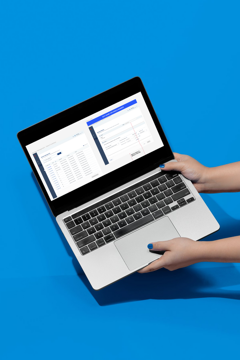
UCaaS Enterprise Customer Portal (Telecom)
A self-service Enterprise platform where B2B users can easily view your organization's number inventory for Geo/Toll Free phone numbers integrated with Calling apps
Problem
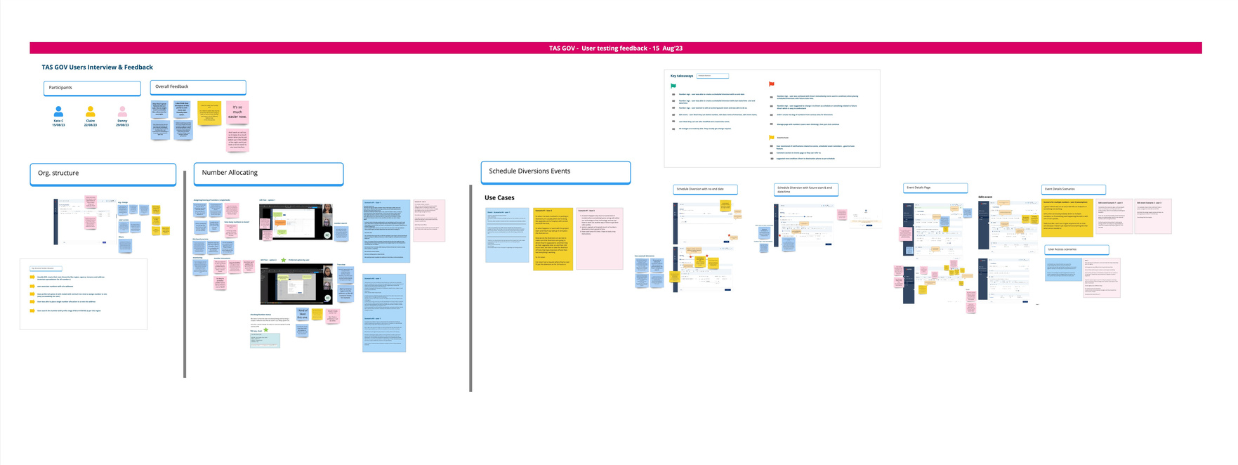
User Research
Key Findings
Users of the customer portal are experiencing difficulty navigating from the homepage to specific tasks, leading to frustration and decreased efficiency. This issue is hindering user onboarding and overall portal usability
Interviews: Conducted in-depth interviews with B2B users to understand their goals, pain points, and experiences within the portal.
Usability Testing: Observed users as they attempted to complete common tasks, identifying areas where they became confused or lost.
Empty state: The homepage as an Empty state was making it difficult for users to quickly identify and locate relevant tasks.
Lack of Clear Pathways: Users struggled to find clear and intuitive paths to navigate from the homepage to their desired tasks.
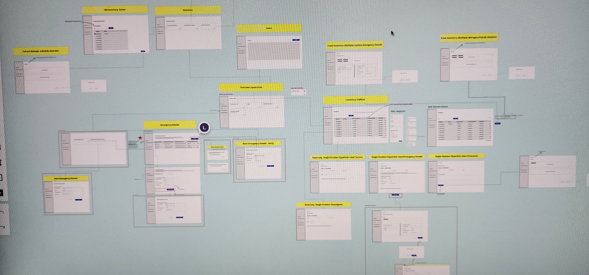
Solutions
- Quick link cards on the homepage: Display a clear path indicating the user's to quickly access the page/feature within the portal.
- Avoid Empty States: Utilize visual elements such as quick link cards and helping text to represent different task categories to avoid empty state screens which confuses users.
User Testing Insights
- 7/7 users were able to navigate from quick links
- 6/7 users were successful in placing diversion to the numbers
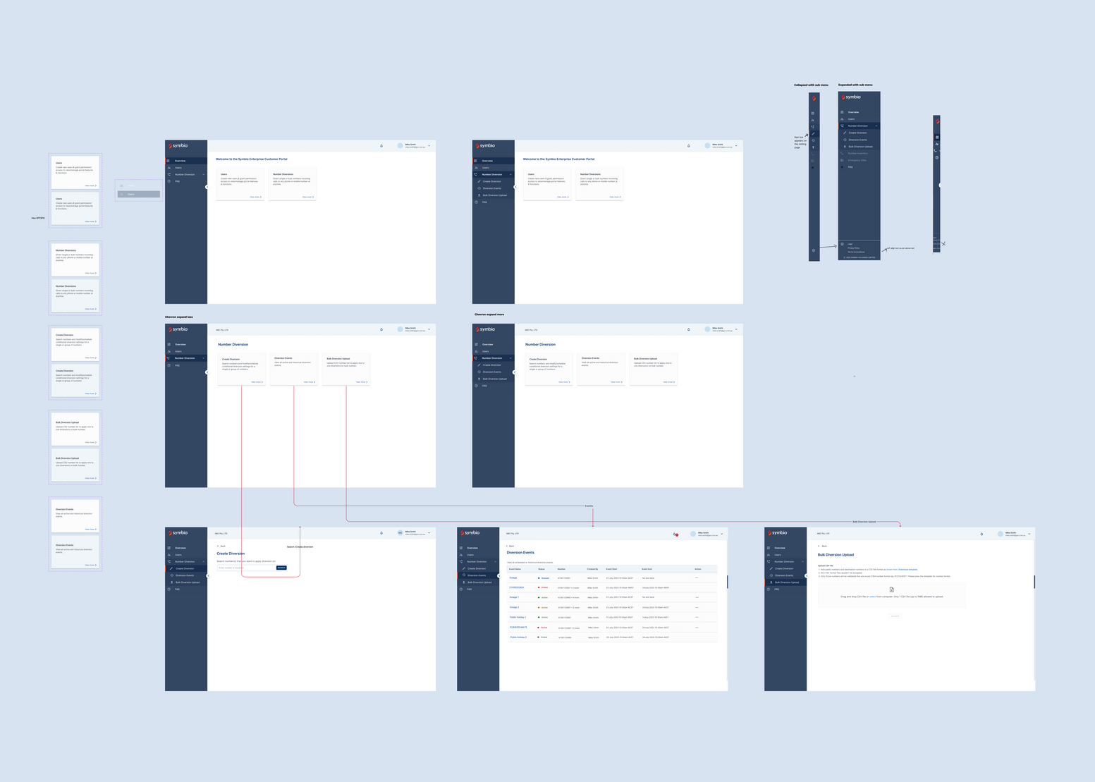
Released New Navigation Design & Impact
- 25% increase in user traffic after the new navigation iteration was released.
- Increase in call diversion transactions via portal
- Reduction in call diversion support tickets
- Reduction in onboarding support requests from new users.
UX Case study 2
Role: Sr. UX Designer
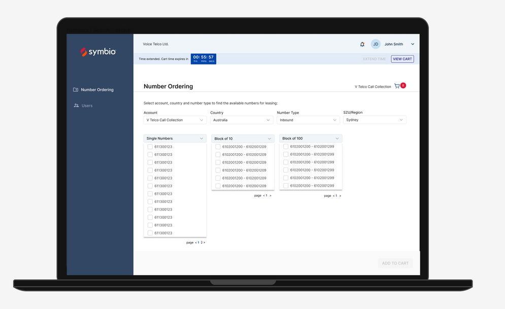
CPaaS Platform (Wholesale Number Order/Porting)
A Communication platform as a service where B2B users can easily view Number Inventory and order new phone numbers (GEO/Toll Free) for their B2B customers and provision trunk endpoints.
Problem
- Users were unable to place the number orders for their chosen numbers in the checkout cart.
- Encountered error - number no longer available or expired.
- User has to restart the process again.
User Research
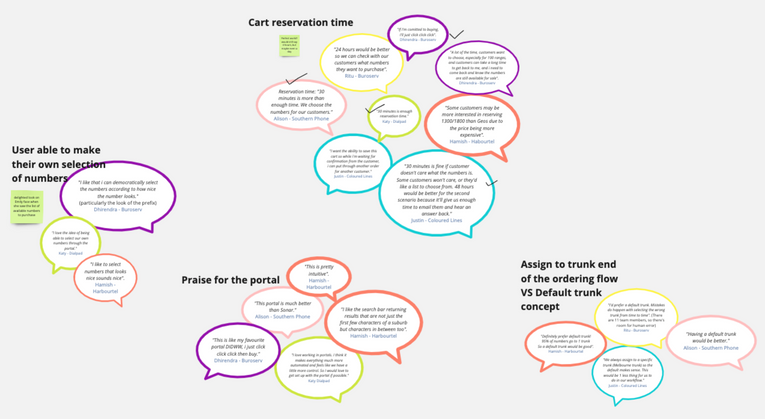
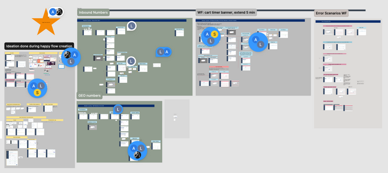
Key Findings
Insights from user testing & interviews:
- Researched data showed users were assuming the numbers are reserved for them for a certain time once the numbers are added to the cart.
- Users were not aware of the time limit in the cart.
Solution
- 60 mins Cart time banner to complete the checkout process or reserve the number for 24 hrs to get customer approvals.
- Added cart timer banner to let users know the numbers are reserved for a limited time only.
- Reducing cart abandoned scenarios and hence increasing the conversion rate.
- 70% FY24 number of orders came through the portal after the iterated features were released.
other UX/UI projects
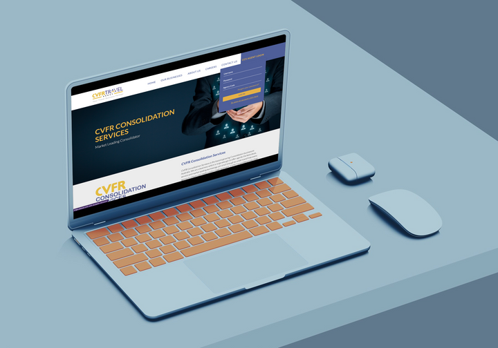
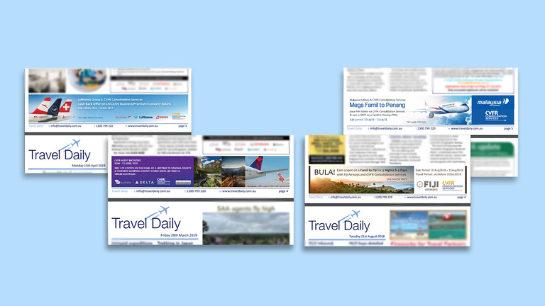
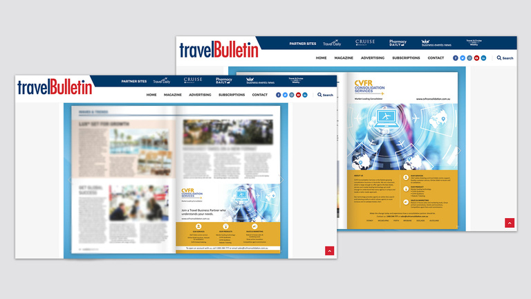
CVFR Travel Group Website Redesign
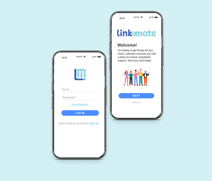
Linkmate
Social Health App
UX/UI design for website redesign (B2B):
Redesigned user experience, content, website navigation, UI, and visual designs to align with the company brand/vision, resulting in a 25% increase in website traffic.
UX/UI design for a start-up organisation:
User research, journey maps and A/B testing for Linkmate onboarding features.
Low to high-fidelity prototype for new features
Wedora for Wedding Photography
Landing Page
UX/UI design for a start-up organisation:
User Research & product market strategy
UI Designs for wedora landing page to attract or engage more users to onboard wedora for wedding photography leads and networking.
digital/graphic design projects
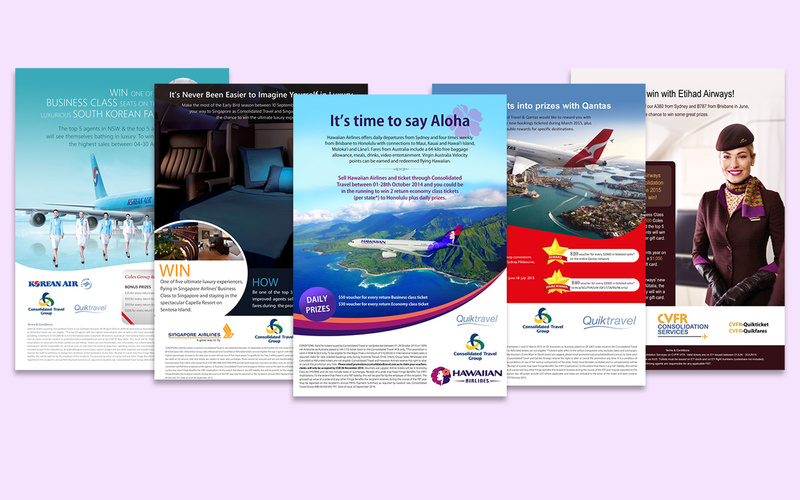
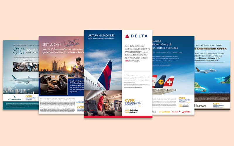
Published digital design artworks in travel media for global airlines’ marketing campaigns.
Contact
Mobile
+61 470 116 577
lipika.works@gmail.com